Apple’s been busy lately refining the user interface OS X for the upcoming Leopard release. However, there are several remaining user interface elements that have yet to be updated to the new Aqua-dark UI. And with rumors that Leopard has reached release candidate status with the latest seed, I’m worried that those Aqua-blue elements will never be updated, and they will remain in the OS for another two years.
First of all, Apple has yet to replace the standard blue bubbly interface objects with the iTunes dark pill interface objects. The new Leopard user interface is pretty much a direct derivative of the UI work Apple has done to iTunes, however Apple has continued to ignore the new iTunes interface objects in the interface transition. While some may be opposed to the iTunes dark objects, the Aqua-blue objects seem so out of place with the new unified UI. I would also be happy if they just updated the scrollbar, if Apple doesn’t think the other iTunes objects work well on a cross-OS level. Hopefully they do something about it before Gold Master.
 Many are also uncomfortable with the new folder icons. Some claim they seem too “IBM’, others too “Windows”, to other they seem too “Linux”. While I have to agree, Tiger’s folder icon set definitely needing a refresh. I think the problem with the new folders lies with its two-dimensional perspective and its overall blandness. If the folders were offset and/or made more realistically, it would definitely improve the appearance of the icons. IndieHIG has come up with a pretty detailed criticism and analysis of the new icons, which highlight many of the complaints I and many others have with the new folder icons.
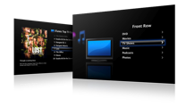 Apple has improved Front Row to resemble and function very much like an AppleTV. So far, the only UI complaint with Front Row 2.0 is the launch and quit transitions. With Front Row 1.0, there’s a nice slick transition between the desktop and Front Row. Apparently with Front Row 2.0, Apple has had to trash that nice transition for a simple fade. Hopefully Apple can come up with a better transition than a fade when it comes time to the release.
Mail.app’s and Preview’s icons remain ugly. Why has Apple not yet unified the entire UI like they promised. Preview and Mail’s toolbars are totally off from the rest of the interface. It’d be alright if they were somewhat decent, but these toolbar icons are simply hideous, especially with the darker unified window backgrounds.
While these suggestions may seem like rather insignificant, I can say that I am not alone that Apple needs to really work on making Leopard the best they possibly can – and to not rush things. Because usually, the first version of an OS X is nearly identical with the final version feature-wise. So please Apple, finish the job.
5 Responses
Steve Grenier says:
I couldn’t agree with you more, words literally right from my mouth. I’m starting to get worried that these things will never change. 🙁
September 26th, 2007 at 7:46 am
Leo says:
This folders are shit. There. I said it.
September 29th, 2007 at 4:20 pm
Andrew says:
Wow, I’m am of exactly the same opinion. The folder icons in the new finder are very plain.
I have been waiting and waiting and waiting for the aqua elements to be removed from Leopard. Waiting with smugness telling everything “oh of course Apple will have iTunes-like scroll bars!”.
October 8th, 2007 at 12:52 am
Andrew says:
Wow, I’m am of exactly the same opinion. The folder icons in the new finder are very plain.
I have been waiting and waiting and waiting for the aqua elements to be removed from Leopard. Waiting with smugness telling everything ‘oh of course Apple will have iTunes-like scroll bars!’.
October 8th, 2007 at 12:53 am
Leopard - 300 plus features but missing one « nergalicious says:
[…] and then I had to suggest a couple of third party alternatives. Instead of making the Finder ugly here, here (not a permalink) and here why not give us something useful? Sort it out […]
October 21st, 2007 at 5:47 pm
Leave a reply