A half a year ago, Appleology featured a rumor in an article, titled “Leopard’s Illuminating Graphical User Interface: Illuminous, discussing a possible user interface that could present itself in Leopard. The article was built off of speculation from Apple’s design themes in their recent software releases, including:
- Aperture
- Apple Pro Apps
- Front Row
- iTunes 7 (including Front Row)
- Leopard Quicklook
- iPhone and AppleTV GUI
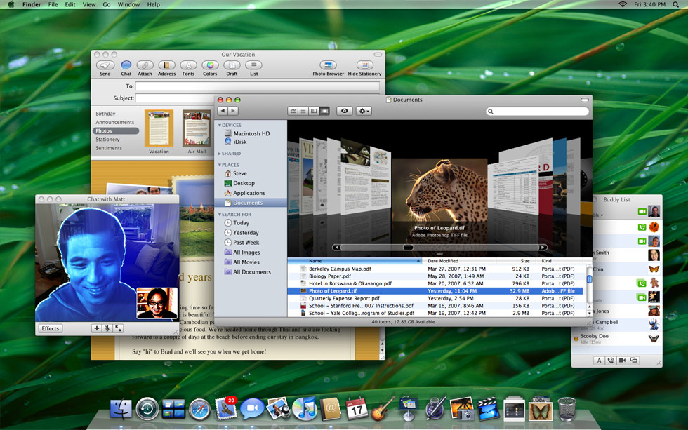
Well, now Steve has revealed the true user interface of Leopard will be, and it comes quite close to our speculation half-a-year ago. However, Apple did not rename OS X’s interface to Illuminous, as rumored. Supposedly, Aqua remains as the OS X interface, but now its evolved into a shiny, iTunes 7-like, animated, glassy user interface that we predicted for Illuminous.
The core of the new interface seems to be centered around the Desktop and Finder, both have been revamped in Leopard. The menu bar is transparent and the dock now has a 3D “block” look. The Finder now behaves much like iTunes 7, with a sidebar and CoverFlow navigation.
Other notable user-interface details concerning Leopard:
- The Finder can now has a large thumbnail view
- The top corners of the screen are no longer rounded
- Front Row now resembles AppleTV’s user-interface
- DVD Player now sports an “iPhoto full-screen mode” interface
- Quicktime movies can now be played fullscreen via Quicklook
- Developers can now build their own effects for Photo Booth
- iCal now has a revamped interface
- iChat features new effects for video conferences and a new sidebar/tabbed navigation
3 Responses
John Muir says:
Looks delicious. Glass with class, as compared with a certain other implementation…
June 12th, 2007 at 7:35 am
The Unix Geek says:
The only thing I miss are the old folder icons…. the new ones are weird.
http://theunixgeek.blogspot.com/
June 12th, 2007 at 8:35 am
Shendig says:
Hardly a radical change. A Hue/Saturation adjustment, a few (very overdue) icon changes, and a slight revamp of the dock.
Come on Apple.
October 24th, 2007 at 11:09 am
Leave a reply